

Colour is one of the most influential decisions you will make when designing a kitchen. It affects how bright or intimate the room feels, how the cabinetry works with the surrounding interior and whether individual features blend in or stand out.
Some homeowners feel comfortable choosing a familiar neutral, while others want their kitchen to have a stronger identity. Neither approach is wrong. The important thing is to select a colour that works with the room, suits the wider home and still feels right once the initial excitement of the renovation has passed.
These 11 kitchen colour ideas include subtle neutrals, natural wood tones and more expressive options. Each can produce a lasting design when paired thoughtfully with the worktops, flooring, lighting and furniture style.
11 Kitchen Colours To Consider
1. Navy Kitchens
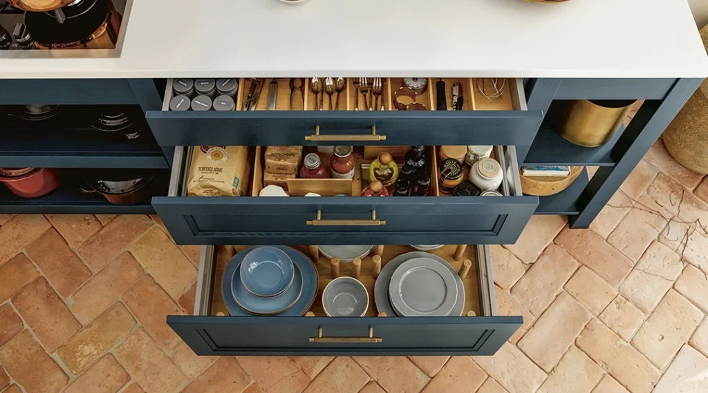
Navy offers the depth of a dark kitchen without feeling as severe as black. It can give a large island or run of tall cabinetry a confident, substantial appearance, particularly in a room with plenty of natural light.
The surrounding finishes will determine whether navy feels traditional or contemporary. A framed Shaker door with warm handles can create a softer, more classic look, while flat-front or handleless furniture paired with pale quartz can feel sharper and more architectural.
Navy works particularly well alongside:
- Warm oak or walnut finishes
- White and softly patterned worktops
- Brushed brass or bronze details
- Warm white walls
- Natural stone flooring
Dark cabinetry can make fingerprints, dust and water marks more noticeable, depending on the surface finish. Viewing a full-size navy kitchen sample will give you a better idea of how the colour and texture will behave in everyday use.
2. Blue Kitchens
Blue covers a much wider spectrum than navy. Pale powder blue can create a relaxed, airy kitchen, while denim, slate and steel-blue shades offer more depth without becoming overwhelmingly dark.
Mid-tone blues are particularly versatile because they can be used across the whole kitchen or limited to an island, pantry or bank of tall units. They sit comfortably beside white, grey and timber, making them easier to incorporate into an existing interior.
Blue can look noticeably different according to the light. A finish that appears grey-blue in a showroom may become brighter beside a sunny window or cooler in a north-facing room. Always view the sample in the property before finalising the order.
3. Peach Kitchens
Peach introduces gentle warmth without the intensity of a strong orange or red. Muted versions can create a soft background, while coral-inspired shades make a more noticeable design statement.
This colour can work particularly well in kitchens that receive cooler natural light. Its warm undertone can prevent the room from feeling stark, especially when combined with cream, light timber or softly veined worktops.
For a contemporary scheme, peach can be paired with simple cabinetry and dark accents. A softer design might combine it with warm white walls, pale oak and understated handles.
Using peach on an island or selected cabinets is a useful option if you like the colour but are uncertain about applying it throughout the room.
4. Pastel Kitchens
Pastels include softened versions of blue, green, pink, yellow and other colours. They introduce personality while remaining lighter and generally easier to live with than more saturated shades.
A pastel kitchen does not need to feel playful or retro. Simple furniture, restrained handles and a plain worktop can give a pale colour a calm and considered appearance.
Pastels can be particularly effective in smaller rooms because they introduce colour without visually dominating the space. However, a pale finish will not automatically make a kitchen feel larger. The layout, lighting and amount of tall cabinetry will usually have a greater effect.
Try to avoid combining too many pastel shades within one kitchen. Selecting one main colour and supporting it with timber, white or another neutral will normally produce a more coherent result.
5. Mint Kitchens
Mint is a specific pastel green with a fresh, slightly cooler character. It offers an alternative to the warmer sage and olive shades that are often associated with green kitchens.
The colour works well with:
- Light oak furniture and flooring
- White or pale stone worktops
- Brushed metal details
- Simple handleless cabinetry
- Soft grey or warm white walls
Mint can be used throughout the cabinetry, but it is equally effective as a smaller accent. An island, breakfast cupboard or group of wall units can introduce the colour while the rest of the kitchen remains neutral.
Because mint contains both blue and green undertones, it can change significantly under different lighting. Compare samples during the morning and evening before making a final decision.
6. Walnut Kitchens
Walnut is technically a timber or wood-effect finish rather than a single flat colour. Its deep brown tone and visible grain can bring warmth and texture to a kitchen that might otherwise feel too plain.
Using walnut throughout the room can create a rich and enveloping design, although it may feel heavy in a compact kitchen with limited natural light. An alternative is to introduce it on an island, breakfast cupboard, shelving or bank of tall cabinets.
Walnut combines particularly well with:
- Cream, taupe and warm grey cabinetry
- Black or graphite details
- Softly patterned stone worktops
- Bronze and brass finishes
- Neutral porcelain flooring
The direction and scale of the grain should be considered as part of the design. Consistent grain alignment across adjacent doors and panels can help the finished kitchen feel more carefully resolved.
7. Green Kitchens
Green has become a broad and adaptable kitchen colour. Pale sage creates a gentle, understated look, olive introduces warmth, and forest green provides a stronger and more dramatic finish.
Its natural associations make green particularly easy to combine with timber, stone and other earthy materials. It can work in both framed and handleless kitchens, so it should not be treated as belonging to one particular interior style.
A muted green kitchen can act almost like a neutral, while a deeper shade may work better as a feature colour. Consider using darker green on the base units or island and a lighter finish above to prevent the room from feeling too enclosed.
Green finishes can contain yellow, grey or blue undertones. These subtleties affect how the colour sits beside flooring and worktops, making physical samples especially important.
8. Pink Kitchens
Pink cabinetry can range from pale blush and dusty rose to stronger coral and mauve tones. Softer versions bring warmth to a room without necessarily making the kitchen feel overtly colourful.
Blush pink can be paired with warm white and timber for a restrained scheme. Dark worktops and black details create greater contrast, while terrazzo or patterned surfaces can give the room a more expressive character.
Pink may be easier to incorporate in smaller amounts. It can be introduced through an island, breakfast cupboard or selected wall cabinets, allowing the main furniture to remain neutral.
Before choosing, consider how the colour connects with adjoining rooms. This is especially important in an open-plan home where the kitchen remains visible from the dining and living areas.
9. Grey Kitchens
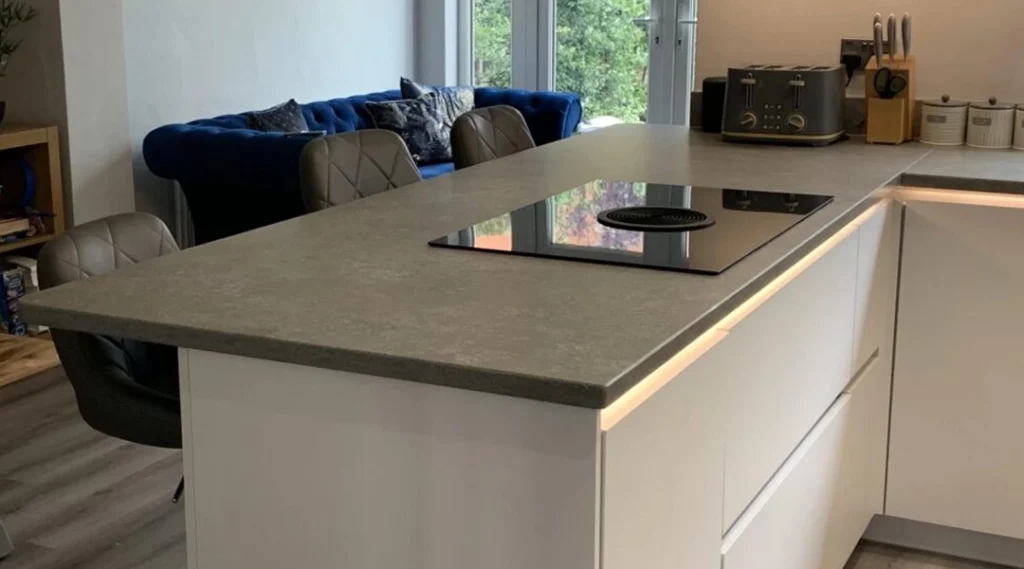
Grey remains useful because it provides more depth than white while retaining the flexibility of a neutral. Pale dove grey can keep a room light, while mid-tone concrete and stone shades create a more grounded appearance.
The undertone matters. Some greys have a blue or cool base, while others lean towards beige or brown. A cool grey kitchen beside a warm cream floor may feel disconnected, even when both finishes looked attractive separately.
Grey can be given more character through:
- Natural timber shelving
- A contrasting island
- Warm metallic handles
- Textured worktops
- Colour on the surrounding walls
Rather than relying on several similar grey finishes, try to introduce a clear change in tone or texture. This prevents the room from appearing flat.
10. Dark Grey Kitchens
Charcoal, graphite and near-black greys create more impact than softer grey cabinetry. They can give a contemporary kitchen a strong architectural quality, particularly when used across tall units or a central island.
A dark grey kitchen does not automatically make a room appear small. The effect depends on the amount of cabinetry, available daylight, ceiling height and contrast provided by the worktops, walls and flooring.
In a darker room, consider balancing graphite furniture with pale worktops, reflective splashbacks or carefully positioned lighting. Timber can also prevent the scheme from feeling overly cold.
Practicality should be considered alongside appearance. Dark matt surfaces may show grease marks or fingerprints, while some textured finishes are more forgiving. Check the care requirements of the exact door rather than judging it solely by colour.
11. White Kitchens
White remains a versatile choice because it can support almost any wider design direction. It can form the basis of a minimalist handleless kitchen, a framed traditional design or a warmer scheme featuring timber and natural stone.
There are many variations of white, including bright white, ivory, chalk and warmer off-white shades. A pure white door beside a warm worktop may look unexpectedly cool, while an off-white finish can create a softer transition.
Using several white surfaces does not guarantee that they will match. Cabinet doors, walls, worktops and appliances may each have different undertones, so samples should be compared together.
White can also benefit from texture. Fluted panels, patterned worktops, timber shelving and carefully planned lighting can prevent a pale kitchen from feeling featureless.
Should You Use One Colour Throughout?
A single colour can create a calm and consistent kitchen, but it is not the only option. Two-tone designs allow different parts of the room to be defined without introducing several unrelated finishes.
Common approaches include:
- A darker island with lighter wall cabinetry
- Timber tall units beside painted base cabinets
- Dark lower cabinets and paler upper units
- A contrasting breakfast cupboard or drinks station
- One cabinet colour with a different internal finish
The colours should still have a clear relationship. Repeating an undertone, timber finish or handle colour can help separate elements feel connected.
How To Choose A Kitchen Colour
Photographs are helpful for gathering ideas, but they do not show exactly how a finish will look in your home. Before committing to a colour, consider:
- The amount and direction of natural light
- The flooring and finishes that will remain
- Whether the kitchen is open to another room
- The size and position of tall cabinets
- The worktop and splashback colours
- How easily marks appear on the chosen finish
- Whether you still like the colour under evening lighting
Looking through completed kitchen projects can help you see how different colours work across full rooms rather than isolated samples.
It is also worth taking cabinet and worktop samples home where possible. Place them beside the existing floor and view them at several times of day before making the final choice.
Create A Colour Scheme That Suits Your Home
A lasting kitchen does not have to be neutral. Navy, green, pink and peach can remain enjoyable for years when they reflect your taste and are balanced with the surrounding materials.
Create German Kitchens offers furniture in a wide range of colours, textures and wood finishes from its Gomersal showroom. To compare samples and discuss how different combinations could work in your room, arrange a kitchen design appointment.
“`